

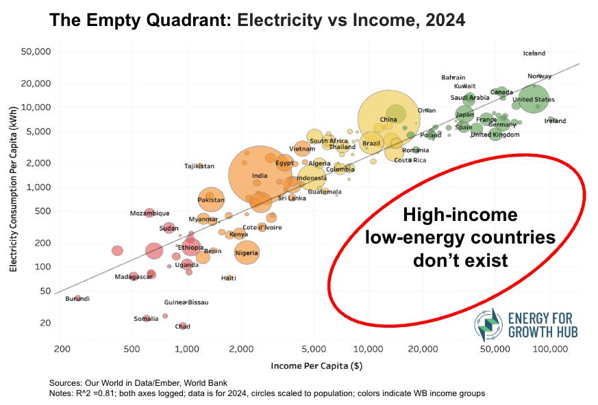
The Empty Quadrant contains no countries. But it does hold big lessons for the scale of energy needed in poor countries
(Please use our stuff but don’t plagiarize it)

I love it when one of my infographics goes viral. People forwarding or replicating it usually means the core message is resonating. Sharing – or thoughtfully criticizing – one of our graphics helps our aim of evidence-based answers to energy shortages in poor countries.
I don’t love it when people copy an idea and claim it as their own. A popular scatterplot of income and electricity use that we’ve used at the Hub for years has been copied often, sometimes unknowingly, sometimes not. Consulting megafirms McKinsey and BCG have each copied a version of our scatterplot within the last year. (FWIW, McKinsey replied with what appears to be bot-generated denials, while BCG apologized and quickly fixed the missing reference. Interpret the varying responses as you will).
Let’s call it The Empty Quadrant.
One way to keep a graphic fresh is to update the data and give it a compelling name that conveys the purpose. So, please meet the latest version of what we’re now calling The Empty Quadrant.
Or here’s a handy interactive version to dig into the data yourself.
New graphic, evergreen takeaway→ poor countries cannot get rich without lots more electricity.
Some development romantics and climate hawks still hold out hope that energy efficiency will be enough for poor countries. Make lightbulbs and machines productive enough and people just won’t need so many kilowatt-hours. Matt Yglesias has a good recent post about the limits of efficiency for domestic energy.
For global energy, The Empty Quadrant says a clear no. No matter how many lumens we can squeeze out of each kWh, countries that aspire to move into middle-income and then high-income status need many multiples more energy than they use today.
No exceptions. The Empty Quadrant is empty.
Countries barely diverge from the global trendline. Yes, sure, Costa Rica and Romania sneak into the World Bank’s high-income class with kWh/capita below 3,000. But every single country on earth with average income above $30,000 uses at least 4,000 kWh per person. Unless a government deliberately wants their country to stay poor, they need to aim for at least this level of electricity use. Probably much more.
You can help spread the message of The Empty Quadrant
Share it. Please just reference the original source :)
Debate it. Please just don’t complain about logged axes (it’s intentional for visual clarity) or insist that correlation is not causality (yep, we know).
Use it for good. The big message is that we need to massively boost the energy available to people in poor countries. My entire organization is dedicated to how we can do it.
The Scale is Scary.
Rich countries don’t just use double or triple the electricity of poor countries. On average, they use 67 times as much. The United States and Nigeria will soon have about the same population size, yet the average American uses 84x as much electricity as the average Nigerian. For Sierra Leone, the ratio is over 500x. Small solutions aren’t going to cut it.
So, please enjoy The Empty Quadrant. Forward it. Paste it. Slam it. Adapt it. Make it better. But please don’t steal it. And, most of all, don’t ignore what it tells us about humanity’s need for an energy abundant future for everyone.