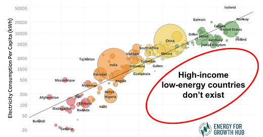
Killer graphic shows why high-income low-energy countries don’t exist
What our new scatterplot tells us about development and electricity
I love it when one image conveys a powerful idea. My fridge continues to resonate because a simple bar chart drives home the scale of energy inequality.
Here’s another of my favorite viral graphics.
The original version of this scatterplot has been circulating on the interwebs using 2014 data — and, annoyingly, without attribution. So my colleague Hamna Tariq and I updated the graphic and posted it on the Energy for Growth Hub site, along with an explanation of the new trade-adjusted dataset from the amazing people over at Our World in Data.
What does the graphic tell us?
1. Wow, electricity and income are very tightly connected.
The correlation is crazy high. For my fellow nerds out there, the new r^2 is 0.83. And, yes, yes, of course, causality goes both ways (so please don’t saturate the comments with this point). We’re not claiming that energy → growth or that growth → energy. But, the data shows pretty convincingly that you cannot have one without the other.
2. High-income low-energy countries don’t exist.
The lack of obvious outliers says a lot. The empty red circle in the lower right explains that no country has ever become rich without also consuming a lot of electricity. The lowest energy high-income country (although just barely at $15,692) is Romania at 2,845 kWh per person.
3. The reverse high-energy low-income countries also don’t exist.
We could have also drawn an empty circle in the upper left. This would show that no poor country has ever generated a lot of electricity and stayed poor. Not a single low-income country crosses 500 kWh per person.
4. The correlation would be even tighter if we adjusted for energy-intensive trade.
Electricity is necessary for higher incomes because people need power at their jobs. This is true in the digital age today more than ever. Yet some export industries use a lot of electrons but don’t create many local jobs or have much local value addition. They just use local electricity for processing and then export the output. The new data in the graphic is adjusted for cross-border trade of electricity, but not for energy-intensive exports — which are, when you think about it, just exporting electricity in another form.
Why does this matter to the graphic? Because a lot of local use is not really local use. The marginal outliers (in the sense they are well above the trendline) of Mozambique (490 kWh, $558) and Tajikistan (1,880 kWh, $1076) help illustrate this point. Both rely on hydropower to run aluminum smelters for export, which means (non-smelting) domestic consumption is lower than the data suggest.
Same story for Iceland (53,285 kWh, $75,135) way up at the top of the graphic. If you’ve been there (if not, you must!), it’s not like Icelanders are wasteful energy burners or living crazy lifestyles. They have super high electricity usage because they are an industrial processing hub and run data centers for consumers in other countries.
All this goes to say that I am confident that if we adjusted the data further for energy-intensive trade, the correlation between local electricity use and income would get even tighter.
5. Most of all, we need more electrons.
As we aim for everyone on the planet to move to the right of the graphic (get richer, please), we can see they need to also move higher (use more electricity). This is unavoidable. We should not pretend we can end poverty and help everyone get a decent-paying job without orders of magnitude more power generation, especially in the less-wealthy regions of the world.
The high-income country average is nearly 10,000 kWh per person while the low-income average is 125 kWh.
Yep. We need more electrons.


Nice graphic here Todd. Energy and income are intertwined because what we call “material wealth” is really just complex arrangements of atoms informed by knowledge.
But we need energy to be able to manipulate atoms in beneficial ways. There is no way around it, except for using energy more efficiently, which we also do.
For comparison; what was the previous r-squared for the earlier version of this plot.
Lovely visual storytelling in a single image by the way.